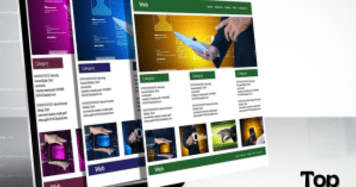
Building A Responsive Design Website: Best practices and tools

Building a responsive design website and maintaining every element to display consistently across all types of devices is the most crucial task for web developers & designers. If you want all your visitors to have a great experience on your website, you must have a website that is responsive and appears the same across all types of devices; Mobile or Desktops. Building a responsive website also means focusing on a mobile friendly website design approach, ensuring seamless usability across smartphones and tablets. Building responsive websites doesn’t only mean that the CMS of your website resizes according to the size of the display screen, but you should also make sure that even the smallest element on your website is correctly visible within its frame, in its original colors.
There are many tools and practices which can help web developers and designers to design responsive design websites accordingly. Here in this blog we will discuss the below topics:
- What are responsive websites?
- Why do they matter?
- What are the challenges that web developers face?
- Best practices to design a responsive website.
- Required tools that help design a responsive website.
What are responsive Websites?
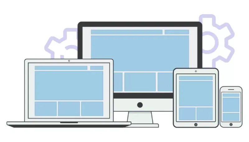
Responsive design websites are the websites that can adapt to all screen sizes whether Laptop, Desktop, various types of tablets & smartphones, and Television screens and can still be fully functional on all types of screens. Building responsive websites that follow a mobile friendly website design ensures that users get a smooth and intuitive experience, especially on smaller devices. These websites are easy to navigate and look good as they have a fluid architecture, made to adapt to every user’s screen. Web designers and developers use media queries, CSS and fluid layout so that users can use every component on the website without any difficulty. To learn more you can read our blog web development introduction comprehensive guide for beginners.
Why do responsive websites matter?
As we all know, the whole purpose of a website is to generate sales or leads. You may also need a website to provide information to your customer that ultimately drives sales to an offline event or to a physical store. A responsive design website definitely matters if you expect to cater a huge traffic on your website, that you can later convert into sales. A responsive website is also important for building a strong brand identity.
Responsiveness of any website allows the audience to scroll the whole website without any hindrance. And grows the visual identity of your brand. If your website is not responsive and not well-optimised then it will take only a second for the people to hit back and switch over to your competitor’s website. This is where a mobile friendly website design becomes critical, as most users access websites via smartphones. Building responsive websites is the need of the hour as you know that nearly 52.64% people across the globe use their smartphones to access the internet, especially for web-browsing. Google in its guidelines gives importance to a mobile responsive design website, and those websites that are not mobile responsive and well-optimised are placed low on Google search pages, even with the right content may not be ranked high. Google gives importance to user-experience and therefore you need a responsive website to show up high on Google Search Engine Result Pages(SERP), among the other sponsored result pages. So a responsive design website will automatically have more traffic as compared to a non-responsive website. Since responsive websites are well-optimised, they will see increased mobile traffic, with a significantly low bounce rate and will easily be able to rank high on search engines.
Furthermore, secured APIs play an important role. It ensures that your website works seamlessly and maintains its responsive design. Get detailed knowledge about "Creating efficient and secure APIs".
Typical challenges for responsive web design
- Compatibility on different browsers: Optimising a website for all browsers is a little bit challenging for web developers and designers. Ensuring that it works and looks the same on all types of screens is crucial steps in building responsive websites. For checking compatibility on different browsers, Cross-browser testing tool can help and give a point to do necessary adjustments according to different browsers.
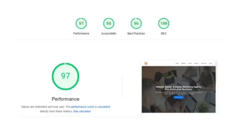
- Loading speed: Ideal loading speed of a website should be 0-2 seconds, so this is the most difficult challenge for developers and web designers to optimise every component on the homepage of a website to make sure it instantly loads on all types of devices. To optimize the load speed for your website, two factors that must be considered are the Largest Contentful Paint(LCP) and First Contentful Paint(FCP). LCP is a core web performance metric which is termed as a Core Web Vital by Google to determine the load speed of a website and to rank them on SERPs. LCP measures the time taken by the largest component on the website (usually homepage) to be rendered on a user’s screen; it can either be an image or a video animation or the text component. FCP on the other hand measures the time it takes for the First element on the same page to be visible on a user’s screen. Slow websites can frustrate audiences and increase bounce rate. So, a responsive design website should load quickly. To achieve this you need to do many things including minifying CSS and Javascript, compress images and use a Content Delivery Network (CDN) to attain a better loading speed, usually less than 2 seconds. Tools like Google Pagespeed can help you determine the load speed of your website and also give you an idea about the underlying problem that is causing your website to load slow.
- Maintaining regularity: Maintaining regularity for a responsive design website on different browsers for the same look and feel is important and challenging for developers. For this, developers can follow standard style guides or design systems for their website’s consistency in design, look and feel.
- Managing advanced layouts: Managing advanced layouts on your website can be challenging to make responsive. Use flexible grids, smaller layouts, manageable sections and media queries for managing your website for advanced layouts. It will help you for building responsive websites and be well optimised.
- Consistency in responsiveness: Consistency in responsiveness is important, keep a check on responsiveness of your website. Use DevTools by Google Chrome to optimise your website for different browsers & devices. It helps you to identify the issue which can affect your users and so that you can fix it beforehand and build a responsive design website.
9 Best practices for creating responsive websites
1. Start with a mobile first approach
Mobile first approach is designing your website with an eye on serving users on mobile devices and small screens, before desktop and other Large screen devices. Since a web developer designs a website using a Desktop or Laptop computer, it by default is able to serve well on large screens. In this scenario it is important to make sure the website has proper readability and accessing it on small screen devices like mobiles and tablets is not challenging. So using a Mobile first approach will beforehand give you a view of how your website is performing & looking on small screens? Starting to design a website without a mobile first approach will compel you to often delete elements and content from your website, to make sure it adheres to Google Pagespeed standards. So, keep this in your mind for building responsive websites.
2. Use Media Query
Media queries are one of the most important way to create a responsive website. Using media query, allows you to define different breakpoints for your website. By using media query you can control your website’s layout on different screen sizes. You can also adjust the padding between paragraphs or to increase the size of buttons to provide a larger hit area on touchscreens. For example, if you want to use a specific font size for your responsive design website on a specific screen then you can do this.
3. Consider to use breakpoints
Breakpoints are the points of different screens, where your website adjusts. When designing a UX one must consider a minimum of 3 breakpoints for Mobile, tablets and Desktop, apart from this one should also consider additional breakpoints for Android and iOS devices. Here are some breakpoint dimensions recommended to design a responsive website:
- 320px for small mobile devices
- 480px for larger mobile devices
- 768px for tablets
- 1024px for laptops
- 1200px and above for large screens
Setting up the breakpoints help you to organise things perfectly for building responsive websites and allows it to perfectly fit on any device.
4. Optimise all images well
Large images and videos slow down websites, especially on the smaller screens. Optimising images helps to make loading speed faster and it also gives a better user experience and helps in creating a responsive design website. There are many tools on google which can help you to optimise images and videos without compromising on the quality.

5. Pay attention to fluid grid layouts
Fluid layout means that elements on your website are resized equally and can adapt to all screen sizes smoothly. Use flexible percentages like ems & rems, Set minimum & maximum width and use SVG image format which can be scaled perfectly without losing its quality.
6. Use SVG images
Scalable Vector Graphics (SVG) are a great alternative to PNG or JPG images. SVG images scale perfectly as compared to PNG or JPG images. They look sharp and quality is great at any screen size. PNG or JPG images can diminish in colour quality and blur when seen on different screen sizes. On the other hand SVG images look good at any screen sizes, that’s why they are best for Logos, icons and other graphic designs. They are one of the best image types for building responsive websites.
7. Test on various devices
Before making your website live, just make sure it looks good on all devices. Many times there are many loopholes in a website when it is made live and it impacts on your audience very badly. Testing beforehand on various devices also gives you ideas, what you need to do and what you shouldn't for creating a responsive design website? So, test on various devices before uploading your website, you can do this by using real devices or emulators & simulators or simply by using the “Inspect” element by right clicking on the browser.
8. Ensure large tap area for buttons
Buttons are important, after all they are the ones that help people to navigate the whole website. For this don’t use fixed units, use units like ems or rems. Just make sure that all text on buttons also looks perfect on all screen sizes. Give enough spacing to the buttons and avoid accidental clicks. Test all buttons functions as well and do the best solution for those that are not working, this will improve user-experience on your responsive design website.
9. Think about minimalism
Use minimalistic designs on your website and avoid messy things. Using cluttered designs can be staggering specially on the small screens. To provide an engaging experience to users, it is important to think on minimalistic designs. For this focus on the most important content and don’t use unnecessary features & elements that can be distracting and too flashy to the eyes for a responsive design website.
Best web development tools for responsive web design
Bootstrap
Bootstrap is a popular open-source framework for frontend development. It comes with the grid system pre-designed for building responsive websites. It comes with lots of features with components like Navbars, Buttons, Forms, Modals and many more.
CSS
CSS is the popular web development language to style websites. It is used to control fonts, colours, layouts and much more. Media queries are important to designing responsive web designs through CSS.
Grid layouts
CSS grid layouts are one of the powerful tools for designing responsive websites. It helps designers & developers to divide your page into columns & sections and put content into specific areas.
Flexbox
Flexbox is one of the important tool in CSS, it is a CSS module and helps in designing responsive & flexible layouts. It helps you to adjust items and allot space within containers & help for a responsive design website.
Figma
Figma is a cloud based designing tool, which helps you by providing you with real-time collaboration. You can share your designed websites and prototypes here for feedback. To learn more about this you can read our blog the complete 2026 guide: choosing the best web development softwares and tools.
Actual Examples for responsive web - design
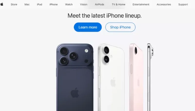
Apple
Apple is a well known company and its website is known for its smooth responsive design. Its site fits beautifully on all the screen sizes and gives an excellent viewing experience to users. Use of the high quality image on the site gives an ultimate viewing experience. Apple’s website can be one of the best examples of Responsive websites and designes.
Expedia
Expedia is one of the best example of a responsive design website. Its layouts fit beautifully on all the devices, providing the user a good experience. Content and pictures change actively, assuring a sleek user experience.

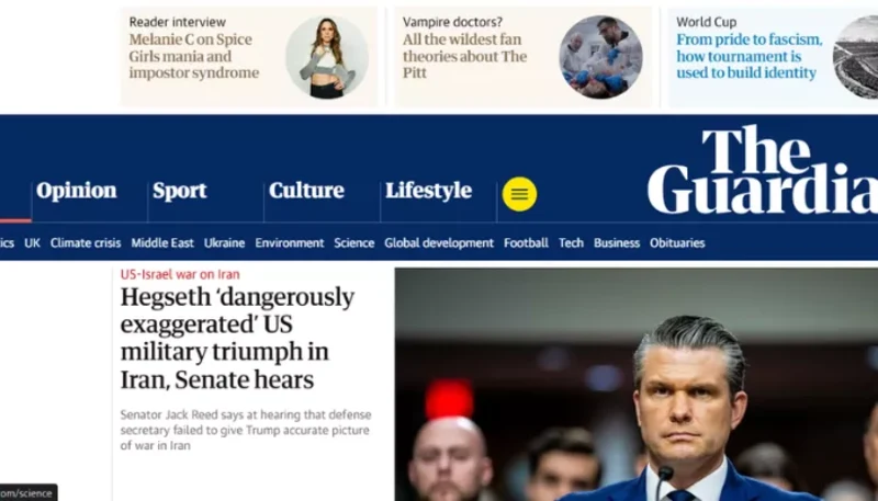
The guardian
The Guardian is also well-known and its news website is another great example of a responsive design website. The pictures and videos change dynamically on all the screen sizes. News articles are also readable on all the devices. This website gives importance to the content and makes sure the important ones are highlighted first.
Justo Consulting
Justo consulting is a Web Development SEO and Digital marketing company. Their website is also a great example of how building responsive websites can enhance user engagement. The theme and choice of color is good. The website also adjusts on all the screens. Justo consulting’s website is a must see for you.

Now you know that creating a responsive website is not optional but essential. For its seamless working on all of the devices, improving user experience, for increasing ranking on the SERP and also for the conversion rates. Creating responsive design is now mandatory. In above blog tools and best practices are mentioned which can help you in creating your responsive website. Also any Professional website design agency can help you By building a site that adapts on all of the screen sizes.
The best website design agency like Justo consulting can help you in creating a website of your choice . Here our website designers build websites by using the latest technologies, and also ensuring its performance, design and responsiveness.
Explore our custom web development services tailored for small businesses
Conclusion
Therefore, by using the right tools and considering best practices, it's easy to make a responsive website. It’s important to create a responsive design website because that works well on all devices and fulfils the criteria of search engines. It also improves the user-experience, SEO and helps in generating leads & traffic on the website. Growing traffic on websites increases your search ranking and can help place your website on the first page of Search Engine Results Pages, specially Google. Get help from Justo Consulting, which is a top web development company, and can help you build your responsive website. Contact us today.
FAQ
What are responsive websites?
Responsive websites are easy to navigate and adapt to all the screen sizes. They look good and work smoothly without any hindrance on all the devices.
Why responsive websites matter?
Responsive websites are important, they allow easy and smooth navigation in fact they help in leads generation, organic traffic, technical SEO and a better ranking on Search pages after consistency.
Are canva websites responsive?
No, canva only provides a template for website creation, these websites are not responsive. For responsiveness you have to put your efforts. It requires best practices and adjustments of the content and images accordingly.
Are wix websites responsive?
No, wix websites are not responsive, wix allows you to make websites but for it responsiveness you have to look at all the aspects. Like adjustment of the images, technical SEO, interlinkings etc.
What are best practices for responsive web design?
There are many best practices for responsive websites and web design. Some of them start with mobile first approach, use media queries, optimise all images, think about breakpoints, go with minimalism when designing your website etc. For other practices and tools check the above blog.