Flexbox Made Simple: A Beginner’s Handbook
Introduction
Flexbox is a CSS Layout tool that simplifies the way we arrange elements on a web-page. Before Flexbox, creating even basic layouts often required complicated and unintuitive tricks; Flexbox provides a straightforward and reliable method instead.
Flexbox is a one-dimensional layout model that can be used to arrange, align and distribute elements within a container, even when their sizes are unknown or dynamic. Flexbox is direction agnostic because it allows elements to be laid out dynamically in either a row (horizontal) or column (vertical). This means the elements can adjust themselves gracefully to different screen sizes without endless margin tweakings.
Flexbox arranges elements either in a vertical direction or in a horizontal direction. It can not be used to arrange the elements in both the directions (vertical and horizontal direction) at the same time. If we want to arrange the elements in both directions at the same time then we have to use a Grid. Flexbox is also used to build a responsive website.
Basics and Terminology of Flexbox
A Flexbox has two axes: Main axis and Cross axis.
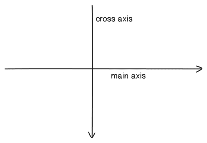
Main axis: The main axis in a Flexbox is the primary direction in which flex items are arranged inside a flex container. The main axis depends on the flex-direction property.
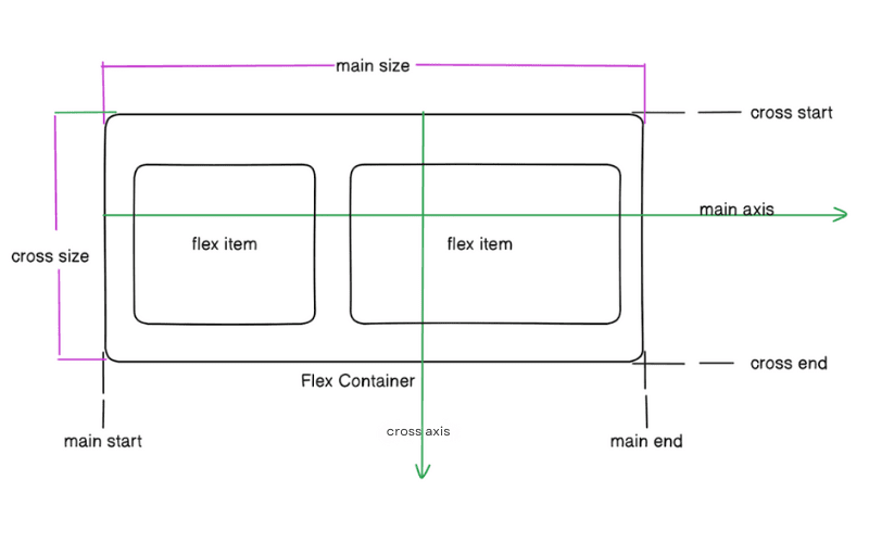
Cross axis: The axis perpendicular to the main axis is called cross axis. Its direction depends on the main axis direction. If the main axis is in the horizontal direction (row) then the cross axis will be in vertical direction (column) or vice versa.
Flexbox properties
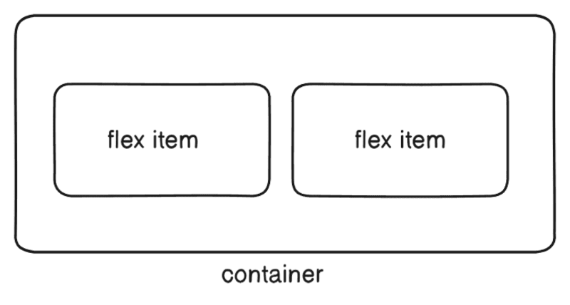
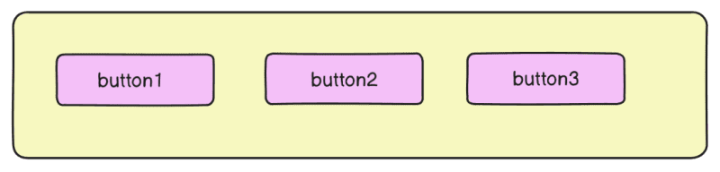
Display: This defines a flex container. If we want to arrange flex-items (elements inside flex container) horizontally or vertically then we have to apply display: flex; property to the flex container.
Container{display: flex}
When we apply display: flex; to a container (flex container). It enables the Flexbox layout and makes all direct children of the container, flex items. By default flex items are aligned in a row(horizontally left to right).
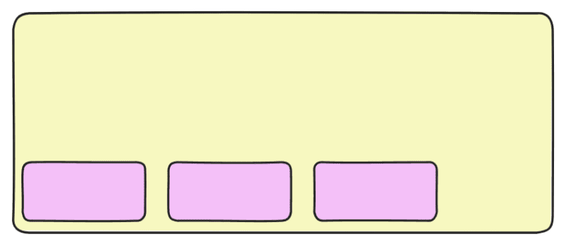
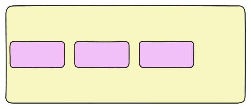
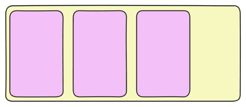
Flex-direction: When we apply flex-direction property to the flex container. It changes the flex direction of flex items of the flex container.
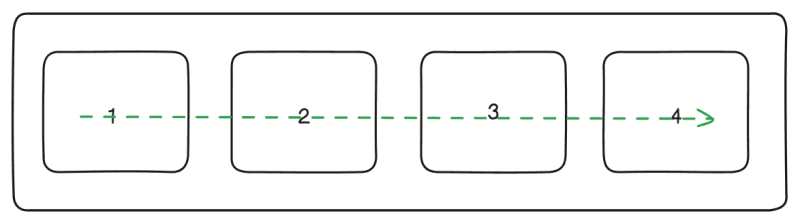
flex-direction: row
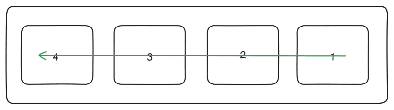
flex-direction: row-reverse
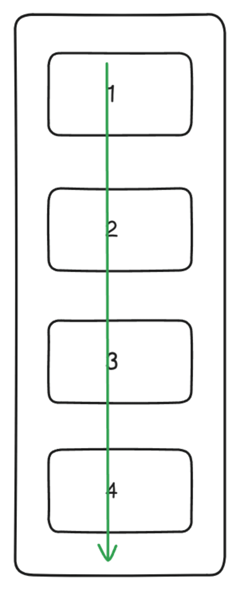
flex-direction: column
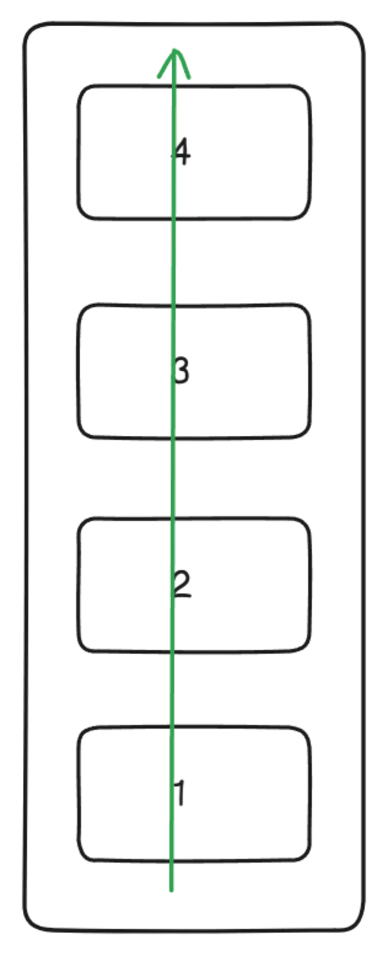
flex-direction: column-reverse
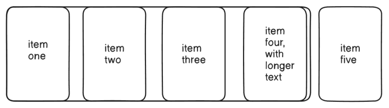
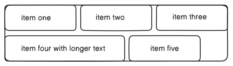
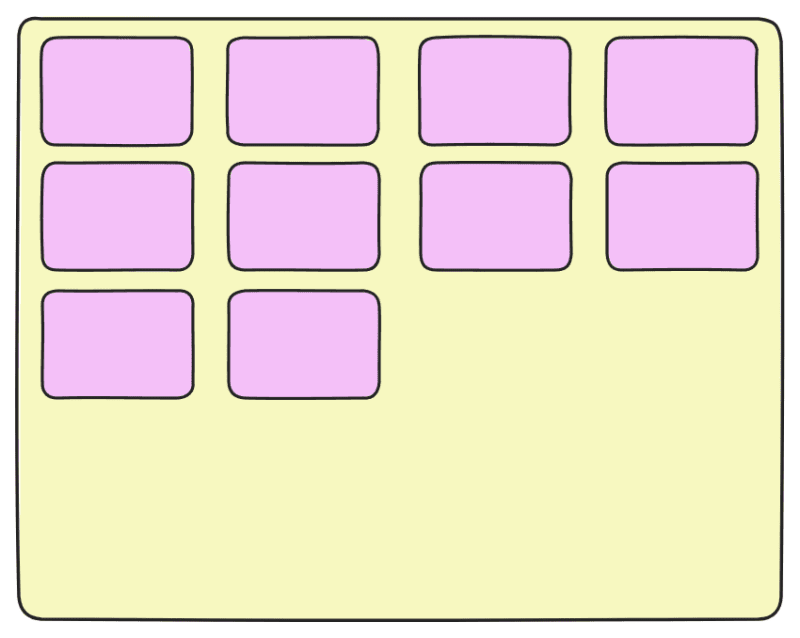
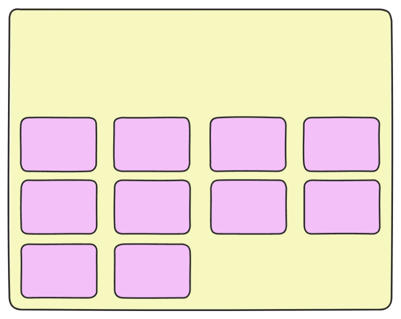
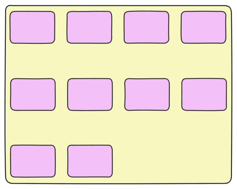
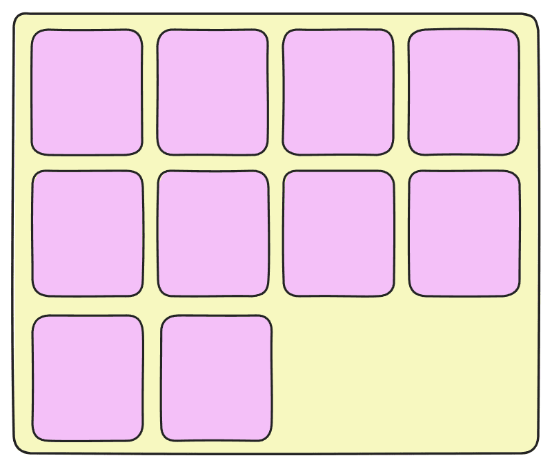
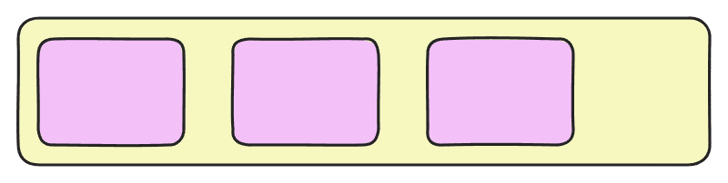
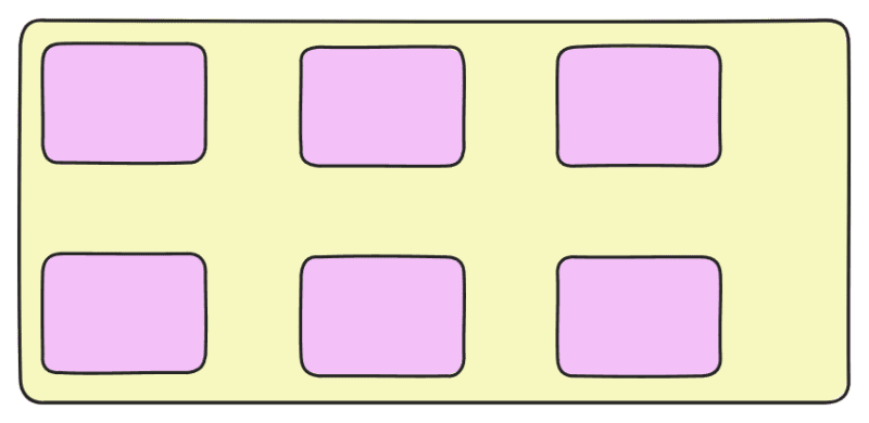
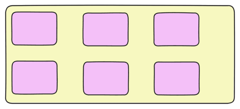
Flex-wrap: Flex-wrap property decides whether flex-items should stay in a single line or wrap onto multiple lines when they don’t fit in a single line of the flex container.
Flex-wrap: nowrap
This(nowrap) is the default value of the flex-wrap. nowrap values align the flex items in one line. If there is not enough space in the container the items will overflow. Initially items will shrink as small as they can, down to the min-content size before overflow happens.
flex-wrap: wrap
Flex items will wrap onto multiple lines, from top to bottom.
flex-wrap: wrap-reverse
Flex items will wrap onto multiple lines from bottom to top.
flex-flow: This is the shorthand for the flex-direction and flex-wrap properties.
container{flex-flow: column wrap};
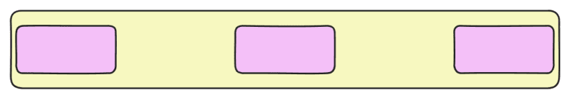
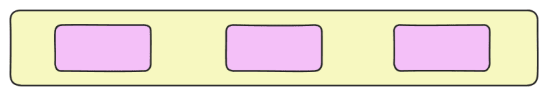
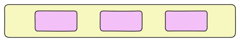
Justify Content: This property aligns flex items along the main axis (horizontal by default). It controls how the space is distributed among the flex items in a flex container.
flex-start: It is the default value of justify-content. It aligns the flex items to the beginning of the main axis inside a flex container.
flex-end: It aligns the flex items to the end of the main axis.

center: Flex items are centered along the main axis.
space-between: It distributes the flex items evenly along the main axis. The first item is placed on the start line and the last item is placed on the end line, with equal distance between the flex items.
Space-around: It distributes the flex items evenly along the main axis but each item gets equal space on both sides. The space before the first item and after the last item is half of the space between items.
space-evenly: It evenly distributes the flex items along the main-axis, space between any two flex items is equal or same including before the first item and after the last item. The space before the first items, between items and after the last items is exactly the same.
align-items:
This property aligns all the flex items on the cross axis.
flex-start: Items are placed at the start of the cross axis.
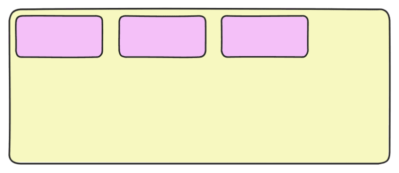
align-items:flex-start
flex-end: Items are placed at the end of the cross axis.
align-items:flex-end
center: Flex items are centered along the cross axis.
align-items:center
stretch: This property stretches all the flex items to fill the entire of the flex container along the cross axis.
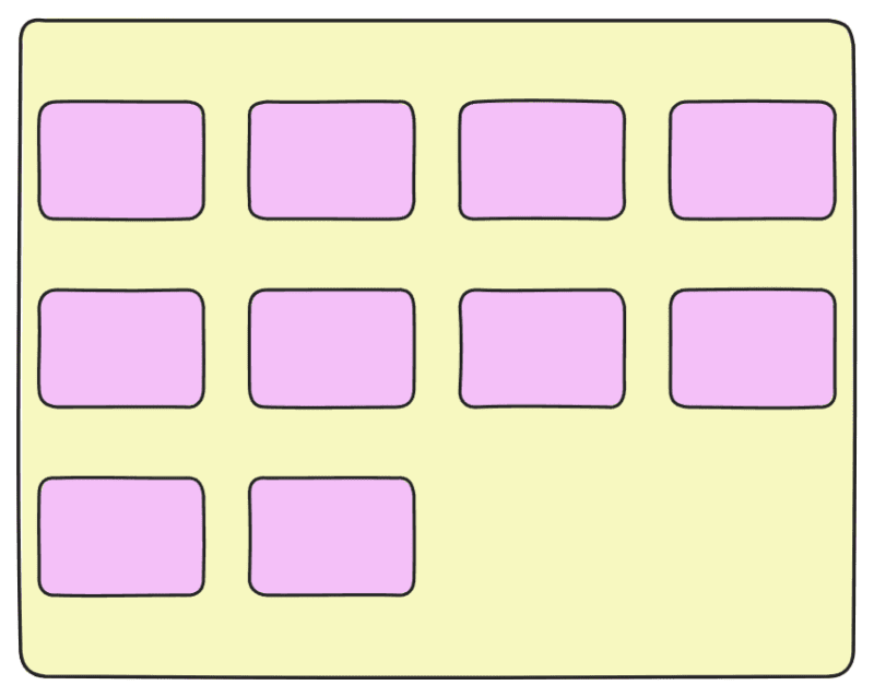
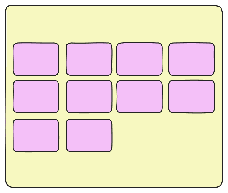
align-content: This property defines the alignment of each line within the container along the cross axis. It controls the space between multiple rows of flex items along the cross-axis. This align-content property in Flexbox is used only when there are multiple rows (or columns, if flex-direction is column) of flex items. It distributes the extra space between and around the rows along the cross axis (the axis perpendicular to the main axis).
flex-start: flex items or rows are packed to the start of the container.
flex-end: flex items or rows are packed to the end of the container.
space-between: The extra space is distributed between the lines evenly, where the first line will be at the top and the last line will be at the bottom of the container.
It works only when flex-wrap: wrap; is applied (for multiple rows) and it does not affect single-row flex containers (use align-items instead). It requires a fixed height or enough space for rows to spread. In simple words we can say that rows are evenly distributed, with first at start and last at end.
space-around: The extra space is distributed between the lines evenly with equal space around each line (including the first and last lines). Or, rows are evenly distributed with equal space around them.
center: Pack of flex items are centered in the container. Or, rows are packed at the center of the cross-axis.
stretch: The lines in the content stretch to take up the remaining space.
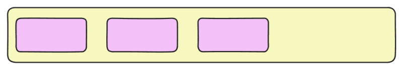
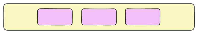
gap: It adds space between flex items without affecting the edge of the flex container.
Gap:15px
Gap:30px
Gap: Row gap Column gap
15px 30px
Order: It sets the order of the flex items in the flexbox container. By default, all flex items have order: 0.Items are arranged in ascending order (smallest order first).
Items with the same order appear in their original HTML order.
Negative values move items to the front, and higher values push items to the end. Flex items with higher specific order values will appear later in the display order than items with lower order values.
button:{order:0}

button3:{order: -1}
Conclusion
Flexbox takes the complexity out of responsive design by giving developers a clean, flexible way to align and distribute elements across different screen sizes. By mastering its properties, you can build layouts that are not only functional but also adapt seamlessly to the ever-changing demands of modern devices. Try experimenting with Flexbox in your next project—you’ll be surprised at how much simpler and smoother your responsive designs become. Flexbox helps developers to create dynamic, responsive and mobile-first web layouts.
FAQ
What is Flexbox and Grid?
Flexbox is a One-dimensional layout model. It works either in a row (x-axis) or a column (y-axis) at a time.
Grid is a two-dimensional layout model. It works in rows and columns simultaneously at the same time.
How does Flexbox work?
Flexbox works by setting display: flex on a container, turning its children into flex items. It then arranges them along a main axis and cross axis using alignment and spacing properties.
Why is Flexbox used in CSS?
Flexbox is used in CSS to build flexible, responsive, and easy-to-manage one-dimensional layouts.
Which is better: Flexbox or Grid?
Flexbox is better for simple, one-dimensional layouts (rows or columns).
Grid is better for complex, two-dimensional layouts.
Can you use flexbox and grid together?
Yes, we can absolutely use Flexbox and Grid together.
What’s the difference between Flexbox and CSS Grid for responsive design?
Flexbox is used for components that need flexible arrangement within a single line either in rows or columns, like a Navbar or Buttons. However A Grid is used to build complex layouts that require arranging the elements in both directions at the same time, like image galleries, or product catalogue.
Can Flexbox completely replace media queries when making a website responsive?
Flexbox reduces the amount of media queries we need, but it can not fully replace them.
Is Flexbox supported in all modern browsers, including mobile ones?
Yes, flexbox is supported in all modern browsers, including mobile ones.